

The Climate series: a reference post.
________
One of the chief climate scientists from the early days of this science is James Hanson (though the history of climate study goes back farther than that).
Hansen is the NASA Goddard Institute chief who penned the recent New York Times piece "Game Over for the Climate" — a reference to what happens if we succeed at throwing all the tar sands sludge into the air.
Our report on that piece is here.
A final note about Hansen. In 1981 he did some preliminary work, part of which produced this graph:
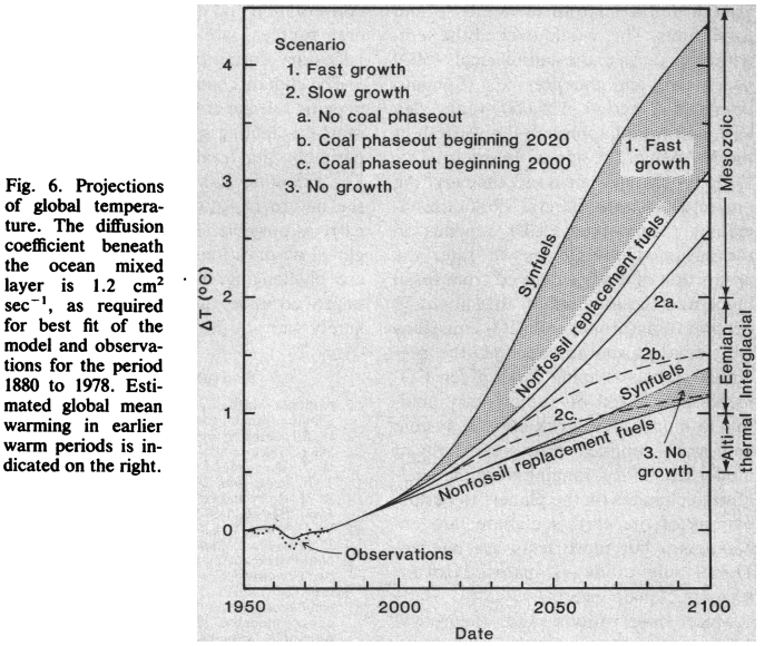
Click to big. 1950 is the zero mark. The vertical axis shows change in temperature and the horizontal shows time. Not pretty.
Some scientists over at RealClimate.org (where Michael Mann publishes) recently marked up that graph with observed change, bringing it current to 2012. Here's the markup:
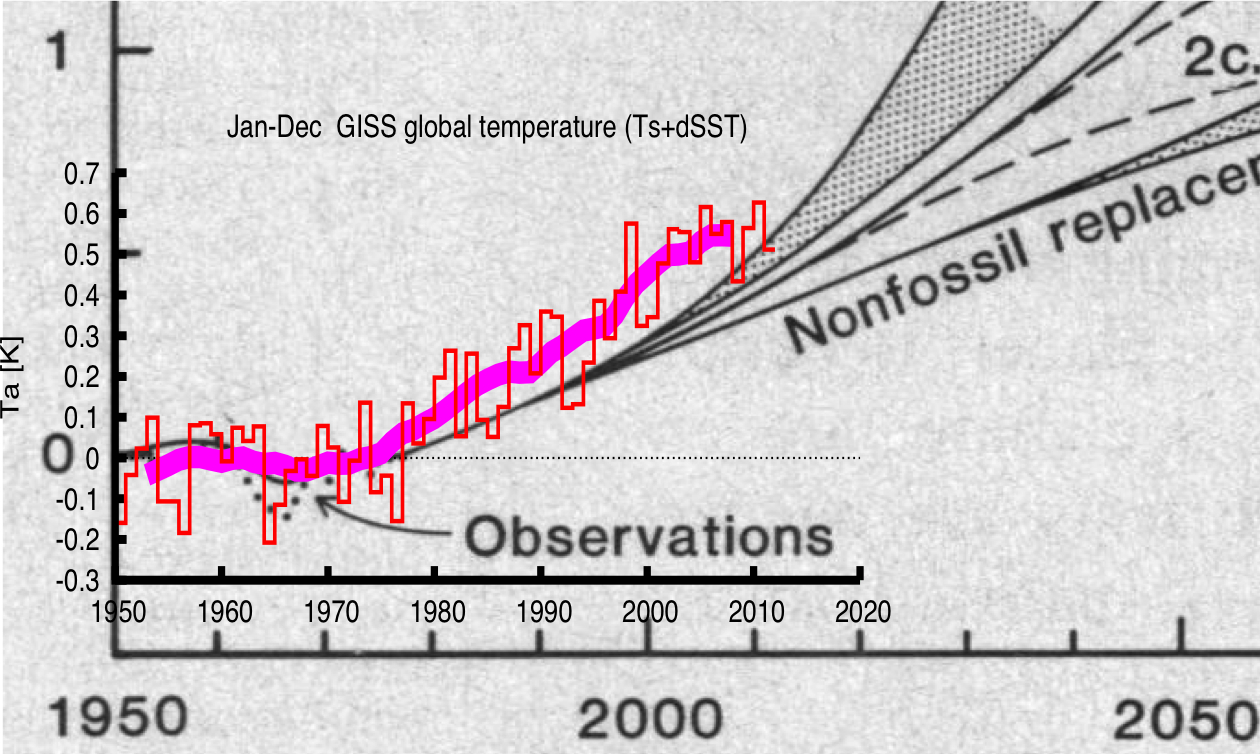
In every case, the observed change meets or exceeds the worst-case prediction. (The larger red line is the smoothed average of all the small observed changes.) Both charts are discussed at RealClimate here.
On the other hand, Charles and David Koch are sitting very pretty, so there's that.
Posted for your consideration. (I discussed this chart and the charts posted here on last night's Virtually Speaking; click and listen if you're so inclined.)
GP
To follow or send links: @Gaius_Publius


